")

In the vast universe of digital marketing, Call to Actions (CTAs) are like shining beacons that guide users to a desired destination.
Whether you’re looking to get visitors to sign up to your newsletter, make a purchase or download a valuable resource, CTAs are the shining stars in the digital darkness.
In this comprehensive guide, we’ll explore everything you need to know about CTAs, presenting you with solid examples and practical tips for creating CTAs that truly move the needle in your marketing strategy.
The basis of Call to Action
At its core, a Call to Action is like an invitation to a party: it encourages you to take the next step. This step can range from clicking a button to filling out a form or making a purchase. CTAs are the connecting mechanism between the content you present and the action you want users to take.
Transformative power of CTAs
Don’t underestimate the role of CTAs in your marketing efforts. Here are some reasons why they are crucial:
- Driven conversion: CTAs are a conversion machine. They are the direct link between a casual visitor and a potential customer.
- Guiding the flow: CTAs are like directional signs. They direct users along a specific path, optimising their journey from discovery to conversion.
- Clear metrics: Thanks to CTAs, you can measure the success of your campaigns. You can see how many clicks you got, what strategies are working and what needs tweaking.
- Focus on action: CTAs create a clear focal point on your web pages and emails. Users know exactly what action to take next.
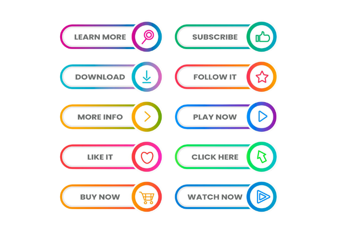
Examples of CTAs that inspire action
Subscription CTA:
“Join Incognota to get exclusive marketing tips delivered to your Inbox!” – This CTA incentivises subscription to a newsletter.
Purchase CTA:
“Take advantage of a 20% discount on your first order today” – This CTA drives immediate purchase with an attractive incentive.
Download CTA:
“Get our free eBook on Social Media Strategies” – This CTA offers a valuable resource in exchange for contact information.
Registration CTA:
“Secure your place in our free webinar on Spokesperson Training” – This CTA encourages registration for an online event.
Tips for creating effective CTAs
- Simplicity and clarity: Use simple and clear language that indicates the desired action.
- Appealing urgency: Add a touch of urgency, such as “Today” or “Limited time only”, to motivate immediate action.
- Focused benefits: Highlight how users will benefit from taking the action. Answers the question, “What’s in it for me?”
- Attractive design: Use contrasting colours and visual elements that attract attention without distracting from the message.
- Strategic placement: Place your CTAs in strategic locations, such as at the end of an article or in areas of high visibility.
- Contextual customisation: Align your CTAs with the content and context in which they are placed.
- Constant experimentation: Conduct A/B testing to evaluate which combinations of text, layout and positioning generate the best results.
Driving meaningful action with CTAs
CTAs are the backbone of your marketing strategy. From generating sales to driving interaction, they are the change agents that guide users to valuable actions.
With specific examples and practical tips, this guide has equipped you with the tools you need to create highly effective CTAs.
Now it’s your turn: experiment, adapt and optimise your CTAs to get exceptional results in your digital journey.
Remember, CTAs are more than just words and buttons, they are the doors you open to more interaction and conversion – make the most of them and make a difference in your marketing strategy!
How to design a successful Call to Action button

According to Copyblogger, in 2023, button-shaped CTAs will increase their click-through rate by 45%.
Ideal size and visual design
The ideal size of a CTA button should be large enough to be visible and attractive, but not so large that it overwhelms or distracts the user.
A typical size might be around 150 to 200 pixels wide and 40 to 60 pixels high. It is important that the button stands out on the page, but it should also be consistent with the overall design of your website or email.
The visual design of the button should capture the user’s attention without being overwhelming. Use contrasting colours that stand out from the surrounding background so that the button is immediately visible.
Using a gradient or subtle shadows can give it depth and make it appear more interactive. Make sure the CTA text is legible and in an appropriate font size.
Images in CTAs
In some cases, you can add images along with the text in your CTAs to increase their visual impact.
However, it is essential that the image is relevant and directly related to the action you are promoting. The image should not be so large that it obscures the message of the CTA, nor should it distract the user from the action you want them to take.
The image you choose should visually communicate what the user can expect after taking the action. For example, if you are promoting the download of an eBook, an image related to the content of the eBook can be effective.
Make sure the image is optimised for the web and does not negatively affect the page load speed.
Ideal colours for CTA buttons
The choice of colours for CTA buttons is crucial, as colours can influence the emotional perception and visibility of the button. Here are some common approaches:
- Attractive contrast: Use colours that contrast with the surrounding background. Bold colours, such as orange, green or blue, are often effective in highlighting the CTA.
- Brand consistency: Use your brand colours to maintain visual consistency and brand identity. This helps users associate the colours with your brand.
- Colour psychology: Consider the psychology of colour. For example, red can convey urgency or emotion, while green can communicate safety. Choose colours that align with the message and emotion you want to convey.
- A/B testing: Conduct A/B tests with different colour combinations to determine which ones generate better click-through rates and conversions. This will help you optimise your colour choices.
Remember that colours should be consistent with your brand identity and should not result in an uncomfortable visual experience for users.
By implementing these aspects in the design of your CTAs, you can significantly increase their effectiveness by capturing users’ attention, clearly communicating the desired action and guiding them towards valuable actions in your marketing strategy.