")
You may have noticed the continuous rebranding announced by some of the world’s best-known companies. They all have one thing in common: more and more they are using simpler logos. You’ve probably wondered why. This trend towards the minimalist branding has very simple reasons. Modern consumers are too busy to understand complexity; instead, they seek clarity. This is why abstract logos are better than literal ones: they offer more room for interpretation without impeding their association with real-life objects or ideas (such as abstract art). They are also better adapted to a multiplicity of formats, channels and media. Let’s dig deeper and see if the result is the right one or if we are moving towards more… boring brands.
The logic of the simplest logos
Logos are the main visual element of a brand’s identity. They are in charge of transmitting the values and fundamental characteristics of a company to its public, which is why they must be well studied to achieve this objective effectively. They can be a symbol, a text or both, and are usually accompanied by an image or colours that reinforce their meaning. They help consumers identify with a company and build trust in its products and services to generate sales.
They are often the first thing we see when we interact with a brand, so they are an important part of our experience with that company or organisation. Some companies even use their logo as their main marketing tool, putting it on products such as t-shirts or coffee mugs and giving these items away at events.
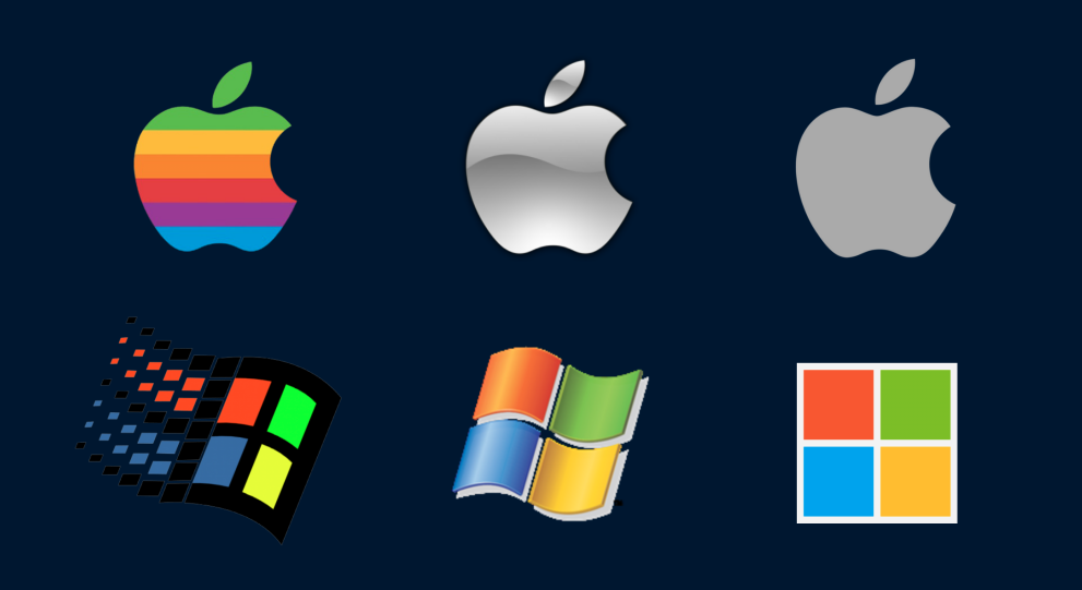
In contrast to earlier stages where logos were developed with exuberant, sophisticated and explicit designs in the use of typefaces and visual representations, we are now at a stage where they are simpler and more abstract, and less literal. As a result, they are also becoming geometrically simplified. The trend towards minimalism in branding has a lot to do with how we perceive brands. Simplicity is an important factor in the user experience. It is easier to remember and identify a brand that is simple and straightforward than one that tries too hard or does not go far enough in communicating its message.
“We are at a stage where logos are simpler and more abstract”.
Lack of time to understand complexity
However, today’s consumer is too busy to undergo this kind of analysis. They don’t have time to waste trying to understand what a brand is all about and would rather understand the product quickly and get on with their lives. What to do in this case?
Logos are a key visual brand element that helps define a company’s identity. The most effective ones must be recognisable, memorable, and unique. In fact, the most successful ones are very abstract, simple, and direct.
They should be differentiated from competing logos, but too much complexity can result in an ineffective design that is difficult to recognise or remember. Instead, a good logo should have universal appeal. It should be timeless enough to still seem appropriate many years after its creation, or at least if the brand itself exists.
The importance of fitting across platforms
An important aspect that determines this trend towards minimalist branding is determined by the internet and digital media. The logo must work on many different platforms, from packaging to displays, from business cards to social media and mobile apps. When designing a logo, many factors come into play related to how it will be used.
For all the above, it needs to be simple enough to fit in small and large spaces without major modifications. As well as for people who are not experts in design or typography to be able to read and understand it immediately.
Take a step towards rebranding
Often, instead of building something new from scratch, rebranding processes are undertaken that evolve what the brand already had. A redesign is not an attempt to change something that people are already familiar with, but to tweak an old design in an effort to improve it.
Rebranding can be tricky because once the brand has established itself in people’s minds as a thing (even if its name has changed), making any significant change requires convincing people that the new look is still recognisable as what they have known before, and attractive enough for them to want it again now that they have become used to something else in comparison.
“Any significant rebranding requires convincing people that the new look is still recognisable”.
The main reason to have an effective logo is to ensure that your brand is easily recognisable. Simple logos also work better on smaller scales. For example, when designing a small button for your website or app, you want it to look professional without taking up too much space (or being distracting). With less information about what the button does and who it represents -as is often the case with simpler designs- there is more room for creativity in choosing how it works within your design environment without compromising functionality or quality of communication.
Simple or boring?
This peeling back of layers towards minimalist branding that brand designs are experiencing, however, is generating a conflict on a professional scale. Should we sacrifice the complexity of a logo’s narrative for aesthetic reductions that equate one logo with another? Are we falling into a flatter scenario, where less risk and a tendency towards practicality leads to more boring proposals?
As always, there is no doubt that we will see a change in trend at some point. Where we now apply simplicity, we will soon see the recovery of riskier typographies, illustrated symbols and complex designs full of nuances, shadows and volumes where before we had done without. The reason, as always, will be to attract the consumer’s attention.
If you need it, we will help you to make this branding (minimalist or not) relevant, attractive and interesting.
Shall we talk?